OS Maps. Adding a live path conditions layer to a product 5 million people trust with their safety.
01Overview
You don't think about the state of a path until you're standing in front of a closed bridge with 10km of daylight left. That's the gap Community alerts closes: it lets people see and report live path conditions inside OS Maps, so the next walker knows before they leave home.
Results
Over 1 million obstacle views.
In the first year.
Validation rate climbed from 50% to 82%.
Across the first three active months.
Peak viewing reached 6.2% of MAU.
Approaching core navigation usage, for a feature under four months old.
02About
OS Maps is Ordnance Survey's route-planning and navigation app, used by around five million people across Britain for walking, running and cycling. It runs on the most detailed mapping in the country. The one thing the map couldn't tell you was what was actually happening on a path today. Community alerts was the first feature to put live, user-generated data onto it.
03Problem
The brief was "let users report path obstacles." The real problem sat underneath it.
OS Maps works because people trust it. A live-data layer that surfaced stale, spammy or wrong reports wouldn't just underperform: it would damage the confidence that makes the product worth opening. Research backed the need. In a value test of 45 users, 82% had changed or abandoned a walk because of an obstacle, and 84% didn't know how to report a path problem to anyone. The demand was real. The risk was the data.
So the brief reframed itself: how do you add a trust-dependent, community-driven layer to a product where trust is the product?
04Goal
Give people enough confidence in path conditions to make a better call before they set out, without compromising the reliability of the map.
The constraints that shaped it: no external data dependencies for MVP, mobile-only reporting to keep location accurate, UGC compliance and EULA changes, and a scope small enough to ship and learn from.
05Discovery
A value test of 45 OS Maps users, plus analysis of reviews and 36 items of feedback on the project ticket, gave a clear picture. 82% had cut a walk short over an obstacle. 84% didn't know how to report one, and only 9% ever had.
The insight that shaped the design: when asked about incentives, core users didn't want rewards. They wanted to see the problem flagged on a live map. So the design didn't lean on points or badges to drive reporting: the motivation was already there. It needed a loop worth contributing to, not a game.
Two obstacle types mattered in different ways. Muddy and boggy paths were the most frequent (3.67 of 5). Flooded paths were the most disruptive (3.87 of 5). Mud is constant. Floods ruin the day. That split fed the priority matrix and the category choices.
I ran a teardown across five products: Waze, Ramblers' Pathwatch, AllTrails, OutdoorActive and Garmin.
Waze was the reference for the loop. Real-time display, community validation, expiry on unconfirmed reports and reporting limits had all been proven at scale. I took the mechanics, not the gamification. Pathwatch was the warning: an engaged base let down by a slow, bureaucratic flow that never told users what happened to a report. AllTrails had gone the other way, putting land owners in charge through its Public Lands Program, which solved a different problem and depended on engagement we couldn't control. OutdoorActive's community contribution was vague and Germany-focused. Garmin's was cycling-only and buried.
The takeaway: the validation loop is the product. Get it wrong and the map fills with noise. Get it right and the data stays credible without a moderation team behind it.
| Product | What it does | Borrowed / Avoided |
|---|---|---|
| Waze | Crowdsourced reporting with real-time display, community validation, expiry on unconfirmed reports, reporting limits | Borrowed: the validation loop and expiry logic, proven at scale. Avoided: the gamification (points, scores, trusted-user weighting) |
| Ramblers' Pathwatch | Direct path-issue reporting to local authorities, photo uploads, engaged user base | Avoided: slow, bureaucratic flow; never told users what happened to a report. The cautionary tale |
| AllTrails | Public Lands Program: land owners manage closures and alerts on their own trails | Avoided: puts land owners in charge, not users. Solves a different problem and depends on engagement we couldn't control |
| OutdoorActive | "Notices and Closures" layer, mostly from tourism organisations | Avoided: vague on community contribution, Germany-focused, not adopted in GB |
| Garmin | Hazard reporting on Edge cycling computers | Avoided: cycling-only, road-focused, hidden unless you own the device |
Discovery used a value / viability / feasibility / usability risk frame. The IP risk was real and got checked properly: relevant Waze and Google patents covered vehicular routing and had lapsed or expired, and we built our own icons in-house specifically so we couldn't be accused of passing off Waze's. The compliance risk was real too, and is covered in the trust section below.
↳Discovery research artefacts

Value testing survey. 45 OS Maps users. The source of the 82% and 84% figures that shaped the brief.

Early hazard definition. What could a path condition actually be? The mind map before narrowing to eight reportable categories.

Live path information. The broader problem space. Mapping what could qualify as a path condition before deciding what to build.

Priority matrix. Frequency × disruption, obstacle types plotted across four quadrants. Shows why flooding and mud drove different priorities.
06Design iterations
This didn't start as a reporting feature. Four directions were explored before landing on the community loop:
| # | Idea explored | Decision | Why |
|---|---|---|---|
| 1 | Mine route reviews for path-condition signals | Rejected | Only worked in the "find a route" space; couldn't tie feedback to a specific path or carry it into route creation or navigation |
| 2 | Source third-party flood data | Rejected for MVP | Solved flooding only; fragmented licensing across multiple agencies. Split out as a possible separate initiative |
| 3 | Derive muddy/boggy paths from aerial imagery, weather and surface type | Rejected for MVP | A genuine ML research track (Sentinel-1 satellite data), promising but not shippable as an MVP |
| 4 | Crowdsource community data on path conditions | Chosen | The version we could ship, learn from and expand. Created data unique to OS Maps |
I argued for the community loop instead. Framed as a feasibility and time-to-value call, not a preference: the flood-data route was the heavy, slow, full-build option, carrying maintenance, freshness and multi-jurisdiction licensing overhead, for partial coverage. The community loop was the version we could ship, learn from, and expand. The PM and I also saw the strategic upside: crowdsourced reports would be data unique to OS Maps, which raised the app's value precisely because no competitor had it. That was the call I pushed for.
Once we committed to community data, the design problem became: what rules make crowdsourced reports trustworthy enough to act on? Every number was a decision, worked through with the PM and engineering.
20m clustering. Phone GPS is accurate to roughly 20m. Two reports closer than that are almost certainly the same issue, and the pins would be impossible to tap apart anyway. So reports within 20m of the same category merge in the UI and stay separate in the database. This came directly from an engineering input on GPS accuracy: a feasibility constraint that set a design rule.
800m drop-pin radius. You can report from your location or drop a pin, because testing showed people wanted to reach safety first ("I'd get to a safe spot before reporting cows in a field"). But only within 800m, the width of an iPhone SE slightly zoomed out. If you have to pan the map to place the pin, you're too far away for the report to be accurate.
30km validation radius. You can validate a report after your walk, from home or your accommodation, but not from the other end of the country. 30km lets genuine validation happen without opening the door to someone confirming Scottish reports from Cornwall.
2-week expiry. Reports auto-expire unless confirmed, and the timer resets on each confirmation. Path data changes slowly, so two weeks balances freshness against churn. The expiry was aligned across all categories at engineering's request, to keep the build simple for MVP: a feasibility trade-off accepted knowingly, with per-category expiry deferred.
Removal that resists spam. One report needs one "not here" to be removed. Two or more reports need two, so a single bad actor can't wipe a confirmed condition off the map.
And the strongest trust call: no usernames. We chose not to show who reported a condition. A name, plus a location, plus a route someone walks regularly, makes them identifiable, and that's a real safety risk for solo walkers, women especially. We had no in-house privacy controls to mitigate it at launch. This was a design-PM call made before the DPO review, then confirmed by it: we'd rather lose the social proof of a name than expose a user. Reporting also needs exact location at the moment of tapping, which made location tracking essential functionality and triggered EULA and DPIA updates. Compliance shaped what the feature could be.
I started with hand-drawn sketches mapping the core loop, then low-fi report a hazard v1 and v2, moving from a tools-menu entry point to a map-first report action. Then I ran moderated remote testing with nine OS Champions, using a seeing / meaning / doing structure and changing the prototype as findings landed. The main results:
Passable or not (7/8).
The biggest insight. Users said the report alone wasn't enough to decide: "I'd still go and see if it's passable." We added a passable / not passable step, surfaced on the map as amber (passable) and red (not). Added for the 9th tester.
Verify, not like (3/3).
Early testers read the thumbs up / down as liking the report, not confirming it. We replaced the thumbs with a tick and a cross, and added "there / not here" wording.
The double negative.
No visible footpath plus a "Not here" prompt was ambiguous: "Not here" could mean the path or the problem. Renamed unclear footpath to resolve it.
Icons failed cold reading.
Muddy/boggy read as "bacteria" (8/9), fallen tree as a "Christmas tree" (7/9). We kept both: recognition builds with exposure, and tapping a report always shows the title, so the short-term cost was worth not over-designing around first impressions.
The toggle was unfindable (9/9).
Nobody could turn the layer on or off without hunting through map layers.
The honest limit: this was remote, at desk, on a high-fidelity prototype. Reporting mid-walk, on patchy signal, with cold hands, is a different test. We knew that going in.
The MVP / MMP / MLP phasing was a roadmap, not just a release plan. Each phase was gated on what the last one proved.
MVP, the smallest loop that earns belief.
Report, validate, expire, across eight temporary conditions, mobile-only, reports on by default. The bet it tested: will people report without incentives, and is community data trustworthy enough to act on? Everything heavier was held back.
MMP, what makes it marketable.
Permanent barriers (stiles, gates, electric fences) as a persistent layer. These behave differently: they don't expire the same way and need a higher confidence bar (5+ reports) before showing as permanent. Plus an admin panel with block/unblock, web view-only, and in-app discovery. Gated on MVP proving people would contribute.
MLP, the version users would love.
Lower-frequency "of annoyance" categories needing dates and times (re-routed by land owner, planned works, events), and predictive layers merging user reports with weather and OSM barrier data. The flood-data and aerial-ML directions live here, as a later bet, once the loop is proven and the data is dense enough to enrich.
The logic throughout: ship the cheapest thing that validates the riskiest assumption first, and defer anything that adds moderation, legal or build overhead until the prior phase earns it.
The land-owner problem.
The brief's second problem, land owners not maintaining paths, was parked entirely. It needed moderation, legal oversight and a different data relationship that would have sunk the MVP.
Barriers (stiles, gates, fences).
Deferred to MMP for the persistence reasons above. Blocked path covered them as a catch-all for launch.
Web reporting.
View-only, deferred. Mobile-first kept location accurate.
Per-category expiry.
Deferred to keep the build simple, by engineering's request.
↳Design iteration artefacts

The four approaches to live path data. Capture, derive, source, display — the framework that shaped the pivot decision.

Lo-fi wireframe, flooding data concept. The initial direction before the pivot to community reporting. Split out as a separate initiative after the viability check.

Lo-fi report a hazard. Reporting screens on the left, viewing and confirming an obstacle on the right.

Verify control, final iteration. Tick-and-cross with "There / Not here" wording, settled after thumbs and icon-only tests.
07Solution
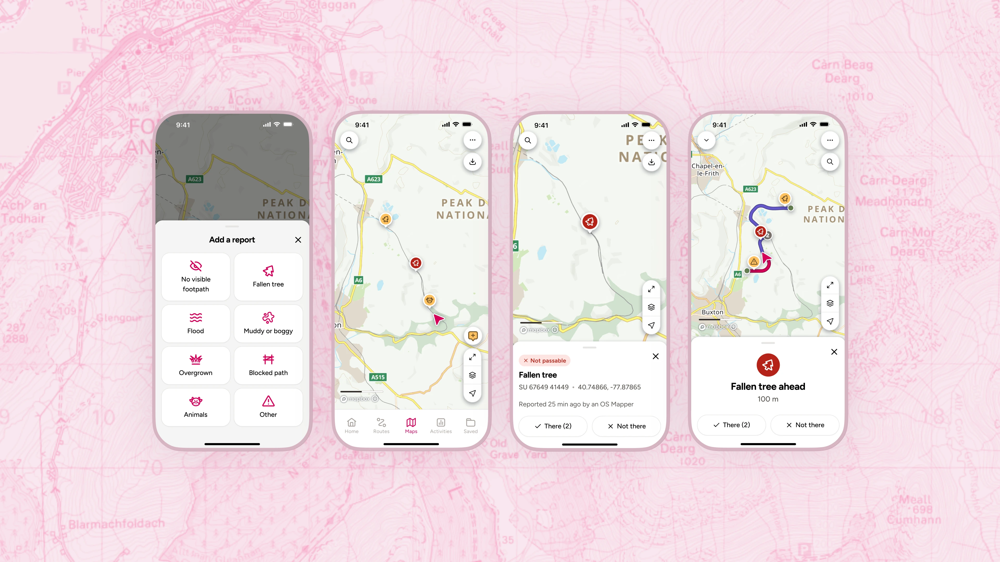
Community alerts shipped with eight reportable conditions: flooding, muddy/boggy, overgrown, blocked path, unclear footpath, fallen tree, animals and other. Reports drop within 800m, cluster within 20m, validate within 30km, and expire after two weeks unless confirmed. Amber means passable, red means not.
Internally the data model uses path condition for a report and confirmation for validation. Externally the feature is Community alerts, and the user-facing language leans on obstacle and hazard, because that's how testers naturally described them.

MVP user flow. The full interaction logic: report an issue, display and validate a report, trust-mechanic edge cases. Each screen in the solution maps to a decision node here.


The shipped report flow, trigger to submission. Map tap → report button → community intro modal (shown once only) → obstacle picker → passable / not passable → confirmation, obstacle on map.

Map view with live pins. Clustered obstacle markers on the route view. Zoom out hides alerts cleanly.

Confirming a report. Tap a pin on the map, see the report bottom sheet with full detail and the "There / Not here" prompt.

Custom icon set. Built in-house to avoid IP risk. Labels always accompany icons so recognition builds over time.
08Results
Community alerts is a high-consumption feature: most people read it, fewer contribute, which is the healthy shape for UGC. In its first year it passed one million obstacle views. At peak (August 2025), viewing reached 6.2% of monthly active users, approaching core navigation usage (7.2%) and nearly double route sharing (3.1%), for a feature under four months old. Contribution sat lower, as expected, but the reporting mechanic ran at 2.4x the rate of photo uploads, the app's existing UGC contribution feature.
The design signal worth more than the volume: across the first three active months, the validation rate climbed from 50% to 73% to 82%. The loop didn't just run, it got more trustworthy as the report pool grew. That's the trust mechanics working in the wild.
Monthly validations as a share of that month's new reports, Jun–Aug 2025.
Against the original targets, both fell slightly short, honestly:
Discovery target.
Target was 8% of DAU. Peak engagement was 6.2% of MAU, a different and larger denominator, so the like-for-like DAU figure is likely higher but wasn't queried. A near-miss, not a hit.
Adoption target.
Target was 2 actions per reporter. Actual was ~1.5.
What was deliberately left out: the land-owner view, third-party data, specific barrier types and per-category expiry, each deferred for a documented reason. The feature was also validated for a US re-launch (localised categories tested across 80 participants), but that's on the roadmap, not shipped: photo attachments were prioritised first, driven by repeated user demand, and are in development.
09Reflection
The trust mechanics did their job. The loop shipped clean enough to run without a moderation team, the validation rate climbed month on month, and the feature reached a million views in its first year. That's the win, and the validation curve is the part I'm most confident about.
What I'm less sure of sits underneath the averages. 1.5 actions per reporter is a mean, and a mean can hide two very different worlds: a broad base of people each reporting once, or a small core carrying most of the load. I don't know which this is yet, and it matters, because the second one is fragile. A feature held up by a few hundred committed reporters is one churn event away from going quiet.
There's also a gap in how I can talk about the headline. We hit 6.2% of MAU, but the original target was set against DAU, and I never closed that comparison. It's the kind of loose end I'd want tied before claiming the number means what people assume it means.
And the land-owner problem is still open. Deferring it was right. But a user who reports a blocked stile and sees nothing happen, because the person who could fix it was never in the loop, is a trust gap the community can't close on its own. The feature tells people what's wrong. It still can't get it fixed.